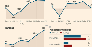
 B:SM will break its investment record this year with 62 million euros
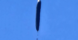 War in Ukraine: when kyiv attacks Russia with inflatable balloons loaded with explosives
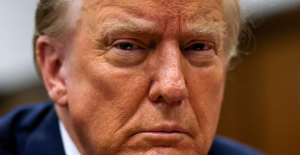 United States: divided on the question of presidential immunity, the Supreme Court offers respite to Trump
 Maurizio Molinari: “the Scurati affair, a European injury”
 First three cases of “native” cholera confirmed in Mayotte
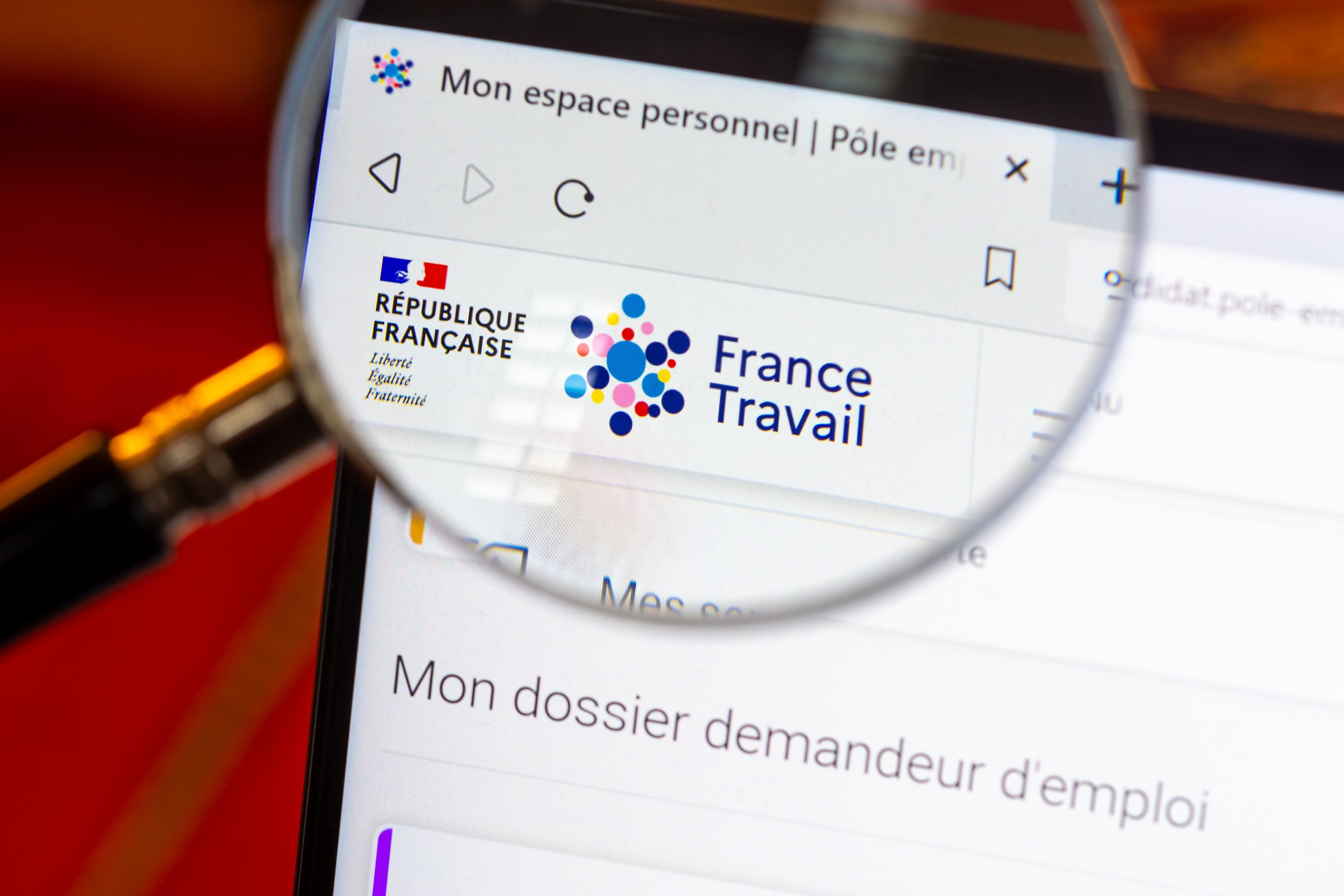
 Meningitis: compulsory vaccination for babies will be extended in 2025
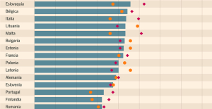 Spain is the country in the European Union with the most overqualified workers for their jobs
 Parvovirus alert, the “fifth disease” of children which has already caused the death of five babies in 2024
 Inflation rebounds in March in the United States, a few days before the Fed meeting
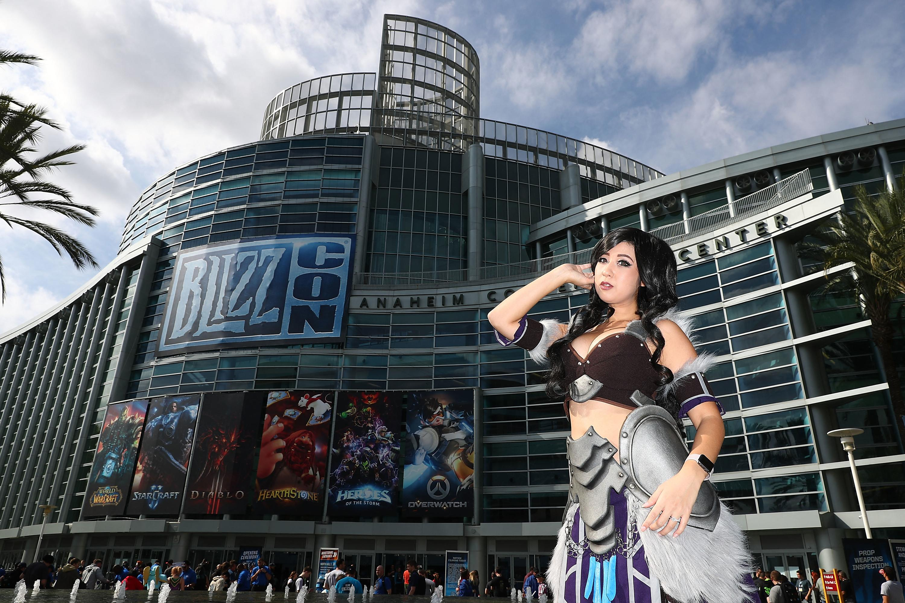
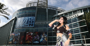 Video games: Blizzard cancels Blizzcon 2024, its annual high mass
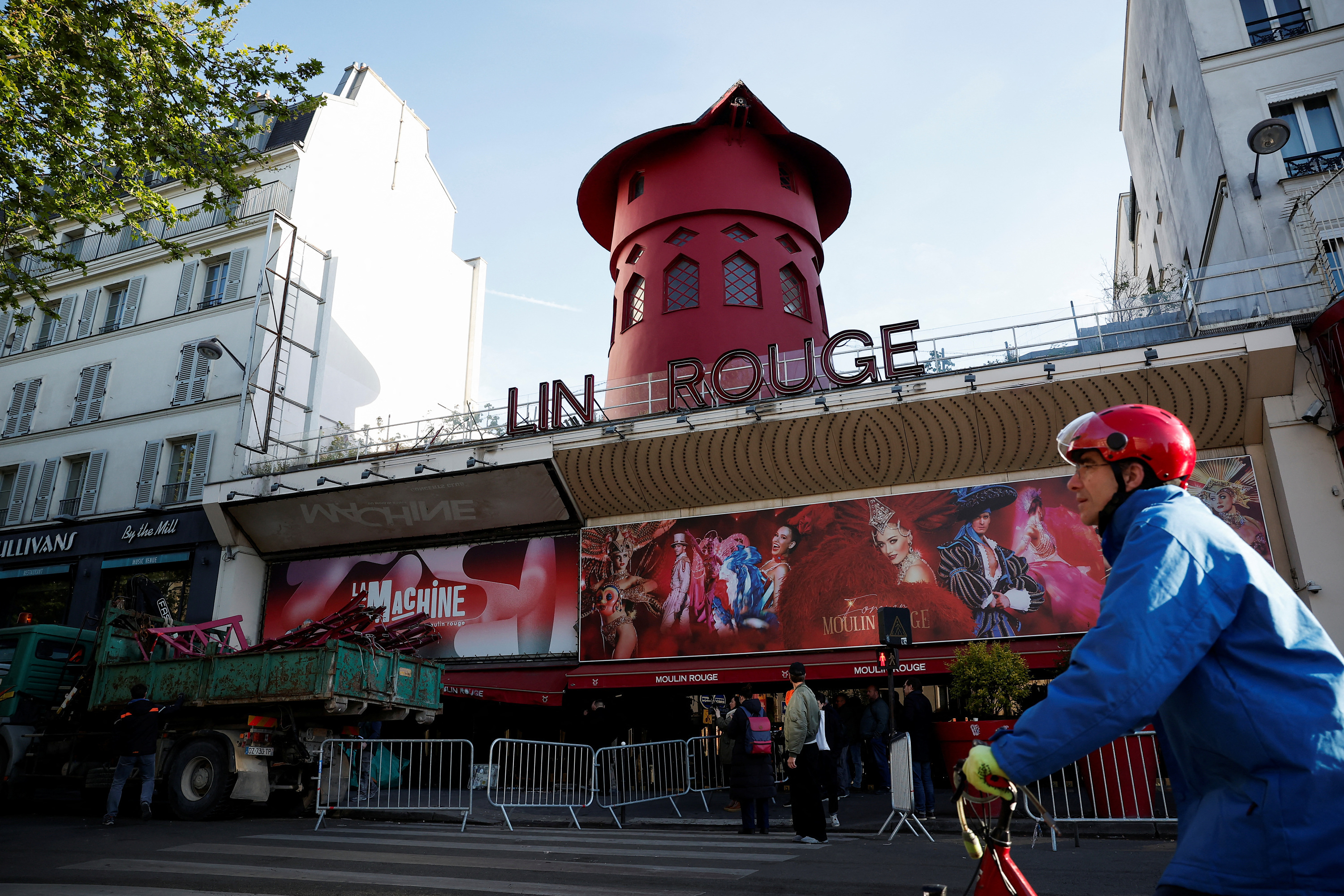
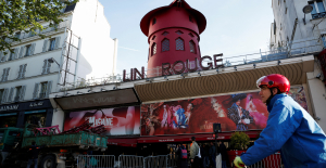 Falling wings of the Moulin Rouge: who will pay for the repairs?
 “You don’t sell a company like that”: Roland Lescure “annoyed” by the prospect of a sale of Biogaran
 Exhibition: in Deauville, Zao Wou-Ki, beauty in all things
 Dak’art, the most important biennial of African art, postponed due to lack of funding
 In Deadpool and Wolverine, Ryan and Hugh Jackman explore the depths of the Marvel multiverse
 Tom Cruise returns to Paris for the filming of Mission Impossible 8
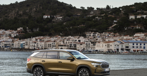 Skoda Kodiaq 2024: a 'beast' plug-in hybrid SUV
 Tesla launches a new Model Y with 600 km of autonomy at a "more accessible price"
 The 10 best-selling cars in March 2024 in Spain: sales fall due to Easter
 A private jet company buys more than 100 flying cars
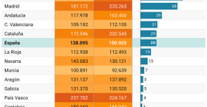 This is how housing prices have changed in Spain in the last decade
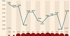 The home mortgage firm drops 10% in January and interest soars to 3.46%
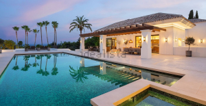 The jewel of the Rocío de Nagüeles urbanization: a dream villa in Marbella
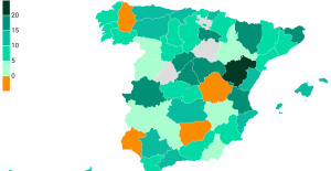 Rental prices grow by 7.3% in February: where does it go up and where does it go down?
 Even on a mission for NATO, the Charles-de-Gaulle remains under French control, Lecornu responds to Mélenchon
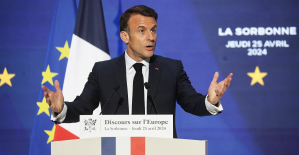 “Deadly Europe”, “economic decline”, immigration… What to remember from Emmanuel Macron’s speech at the Sorbonne
 Sale of Biogaran: The Republicans write to Emmanuel Macron
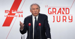 Europeans: “All those who claim that we don’t need Europe are liars”, criticizes Bayrou
 These French cities that will boycott the World Cup in Qatar
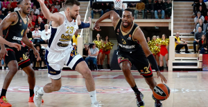 Euroleague: at the end of the suspense, Monaco equalizes against Fenerbahçe
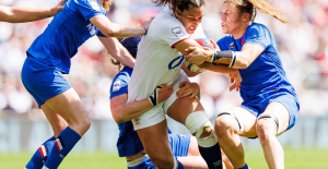 Women's Six Nations: Where to see and five things to know about France-England
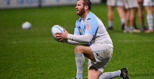
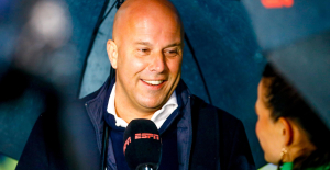 Liverpool: it is confirmed, Slot will succeed Klopp on the Reds bench
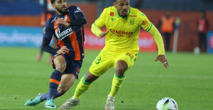 Ligue 1: Montpellier and Nantes back to back, two reds in stoppage time
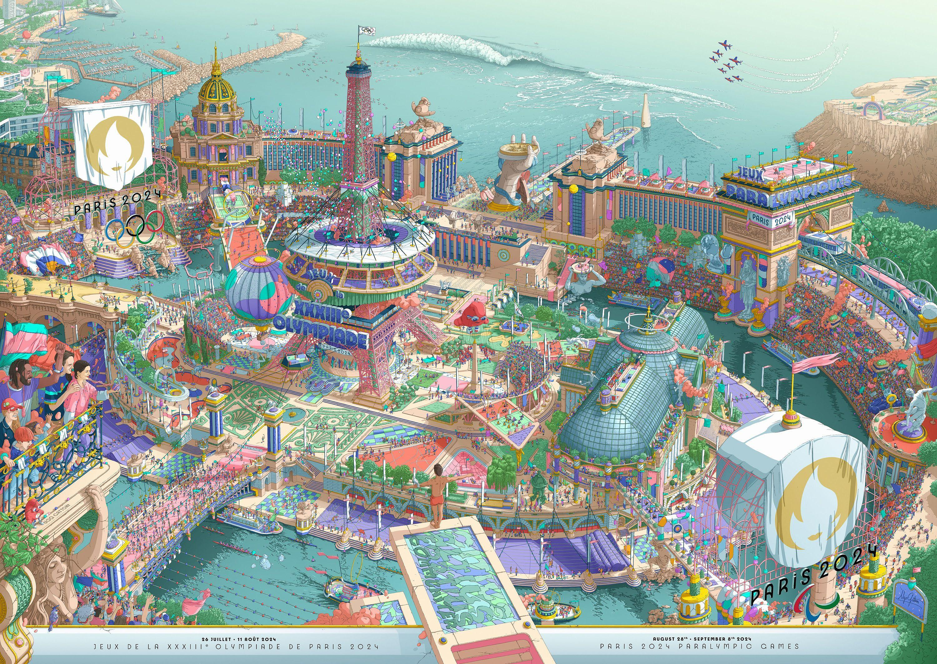
The white sheet was quickly blackened, colored, invaded. Joachim Roncin, graphic designer and design director of Paris 2024, recounts the genesis of the official posters for the Paris Olympic and Paralympic Games: “I started thinking about the subject in June 2023. I wanted to dust off the genre, to tell the story of the madness of Paris 2024 For this extraordinary company, an extraordinary poster was needed. It’s a sublime vision of what I hope these Games will be. The idea was to tell the madness, the fantastic side of what these Games will be. Being a bit unlike an institutional poster, the logo, the date of publication, period. I wanted us to go a little further than that, to summarize, to do a sort of visual zapping of what this event was going to be. I have known the work of Ugo (Gattoni) for several years, it was only natural for me to offer him these posters. He has a rich universe. I wanted lots of little stories within the big story. Ugo brought his madness, his poetry, we could compare it to the work of Myazaki in terms of colors or of Claude Ponti who is a cult illustrator. There are lots of little stories. It's a party, something very joyful. It's a happy, organized mess. Very organized. These are lines of flight, perspectives. There is a kind of abundance.” 40,000 characters, 47 sports (including 18 Paralympics...
The artist Ugo Gattoni painted by hand for 2000 hours. He lets his gaze wander over the drawing “something extremely large”, underlines: “We immediately plunge into a maxi landscape, a teeming stadium. There is a prospect that stretches very far. We don't have time to see everything that's happening, we already know that it's going to be an undertaking to wander through the drawing and understand it. There is something impressive at first glance about the double bill. A great drawing for two posters that live very well separately, as well as together. You have to find the mascots, find the flame bearer, find the disciplines… There are a lot of things to look for.” At the heart of a festive, extremely playful visual, in the “Where’s Waldo” style. Joachim Roncin, enthusiastic, has fun: “It’s a bit of a “seek and find” that we’re used to seeing. There is an inspiration from Paris 2024, the 1920s, art deco, art nouveau. In the same way that Paris 2024 wants to bring Olympism closer to Paralympicism, the mascots, the logos, the medals, the torches are the same, it was natural for me that the Olympic poster and the Paralympic poster be together and tell a story common. They bond completely and discover each other in the details, the stories. It is a poster which is extremely symbolic, which tells many things about the Paris 2024 project, starting with the Bélem which will bring the Olympic torch to Marseille. Also with the Marseille Marina, site of sailing competitions. The Banque Populaire in Le Cléac'h, there is the Eiffel Tower, the Stade de France, all the new sports: break dancing on the roof of the Stade de France, skateboarding, BMX, climbing... There is the Teahupo'o wave in Tahiti with surfers. But there is also Stoke Mandeville, the origin of Paralympism which is on an island because it is in England. There are also many monuments, whether it is the Arc-de-Triomphe, the Grand Palais, the Concorde, the Trocadéro, the Invalides… It is a pharaonic project. I wanted to snub all of today's digital creation, artificial intelligence... I wanted manual, almost artisanal work that also echoes a bit of an athlete who will train for hours. For a sort of fantasy view of a stadium city.”
In which the nods multiply: the wrought iron rings, Marianne which supports the balcony, the Lenôtre gardens which represent the Palace of Versailles with the equestrian competitions, podiums with the Olympic and Paralympic medals. A patchwork in which humor is not absent (with athletes resting on the BMX track or a suspended boxing ring “We don't know how we're going, just that makes me laugh. That doesn't "doesn't make much sense but it takes its place", laughs Ugo Gattoni).
Jumbled together, the Olympic and Paralympic symbols are displayed (the Olympic rings, the Olympic motto, etc.), the specific markers of the Paris 2024 edition (8 mascots are hidden in the design, the ceremony boats on the Seine, the iconic competition sites…), “there is also a free interpretation of the monuments, there is the Arc-de-Triomphe with the aerial metro which passes through it, on the bas-reliefs of the Arc-de-Triomphe, they’re not the right ones, it’s in honor of the women’s march, it’s the marathon route,” says Joachim Roncin.
“There are optical games. There are things that are a little wrong but so that it works to the eye. The beginning of the drawing was super complicated. After color, it’s nice to bring it to life,” says Ugo Gattoni. The color code is part of a vast project, the designer underlines: “It’s very fresh. I was inspired by the look panel for the Paris 2024 Games so that it would match the city. There will be the look of the Games, it will make a whole. There is a predominance of pink and purple on a fairly pastel turquoise background; it’s an atmosphere that matches the flat, degraded look of the Games. We wanted something very fresh, it's still summer. We feel the sun, the festive side, everyone is outside.” Joachim Roncin, author of the famous logo (“Je suis Charlie”) adds: “Pink was important to us. Pink will be the color of Paris 2024. It will be found almost everywhere. On the outfits of volunteers, officials, on signage. It's a color that I wanted to be transversal to all of our elements. So she is quite present. The athletics track is purple, it will be purple at the Stade de France.”
Unveiled at the Musée d'Orsay, the poster could then be exhibited at the Musée Carnavalet. Before existing. In 30x40 cm and 50x70 cm. From 20 euros. In double color poster. In black and white. Before seeing variations flourish with puzzles, postcards with close-ups of extracts.
The completed adventure will accompany Ugo Gattoni for a long time: “I thought about it at night. In good. It was physical. By the end, I was exhausted. I'm getting over it. It's not often that we do this, it's a big challenge. It was the Games, I had to send 4000% of what I can do. I had never done anything this advanced. And I don't think I'll do that again tomorrow. Now I do cubism… (laughs) It’s lucky. I had never done anything in the sporting field. I had already drawn Paris quite a bit, I'm never going to do it again... the Eiffel Tower is a long time. The glass roof of the Grand Palais took a really long time. The crowds... The detail of the sea..."